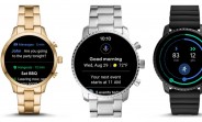
Google just announced a big re-design of its Wear OS in a blog post. The focus here is on usability, new Google Health features and the Google Assistant. Firstly, the notification menu is easier to navigate, more compact and adds a few nifty shortcuts. For example, a simple swipe up will display all of your notifications and a smart reply is just a tap away. This won't even make you leave your notification stream. And by swiping down, you can now access more shortcuts like Google Pay and the "Find my phone" functionality. Google Assistant gets smarter and more contextual. It can...
Click here https://ift.tt/2PdrrEz for entire article. https://ift.tt/2wqRFfU from GSMArena.com - Latest articles


0 comments:
Post a Comment